Nova Hu

Project
Velocity Cycles
Redesigning Velocity Cycles' mobile-web experience to increase sales conversions.
Resposibilites
Lead UI/UX Designer. I managed the research, ideation, wireframing, prototyping, testing, and design iterations.
The problem
Through collaboration with Velocity Cycles’ Product Manager, we identified two major pain points:
-
User Behavior Data – 50% of users were visiting an average of 7 product pages without adding items to their cart. This indicated that users were having difficulty differentiating between the products based on features, likely due to unclear categorization and insufficient filtering options.
-
Checkout Abandonment – 70% of users who added items to their carts left during the registration step. The mandatory account creation process discouraged users from completing their purchases.
I reviewed the low-fidelity wireframes left by the previous designer, and while they attempted to streamline the browsing experience, they did not solve the deeper issue of poor categorization and navigation clarity.
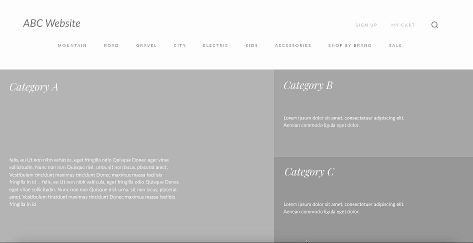
Home Page

Cart Page

Item Page

Sign In & Sign Up Page

Research & Insights
Secondary Research
To better understand industry standards and identify best practices, I conducted a thorough competitive analysis, focusing on key e-commerce giants such as Amazon, Target, and Trekbikes.com. The goal was to assess how successful companies handle product comparison and simplify checkout processes.
Key Insights from Competitive Research

Uses side-by-side product comparison tools with filters to help users easily compare features.

Offers a guest checkout option that captures only essential details for users who want a faster purchase experience.

Implements clear progress indicators during checkout, reassuring users of the steps involved.
These findings highlighted two critical areas for improvement on Velocity Cycles' platform: offering a more robust comparison feature and streamlining the checkout process with a guest option
Design Process
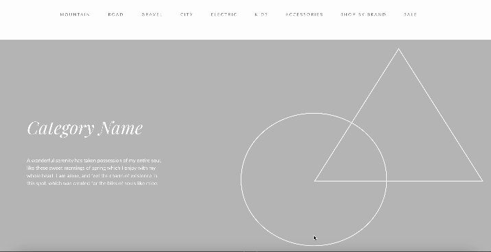
Phase 1: First Iteration - Redesigning Navigation, Filters, and Homepage
Challenges Identified
Unclear Categories: The current site structure did not segment bikes effectively (e.g., road bikes, mountain bikes, hybrid bikes, etc.). Users were forced to sift through multiple product pages to find what they needed.
Inefficient Filters: Filters were not robust, preventing users from narrowing down options based on key features like bike type, price range, and specific attributes (size, weight, gear type, etc.).
Homepage Design: The homepage lacked key promotional areas and clear CTAs (calls to action), making it difficult for users to know where to start browsing.
Key Improvements
1. Revised Navigation
I restructured the navigation to include intuitive, well-labeled categories (e.g., Road Bikes, Mountain Bikes, Electric Bikes) so users could quickly identify the section that matched their needs.
2. Enhanced Filter Options
I introduced more detailed filters on product listing pages, allowing users to sort by bike type, price, and essential features.
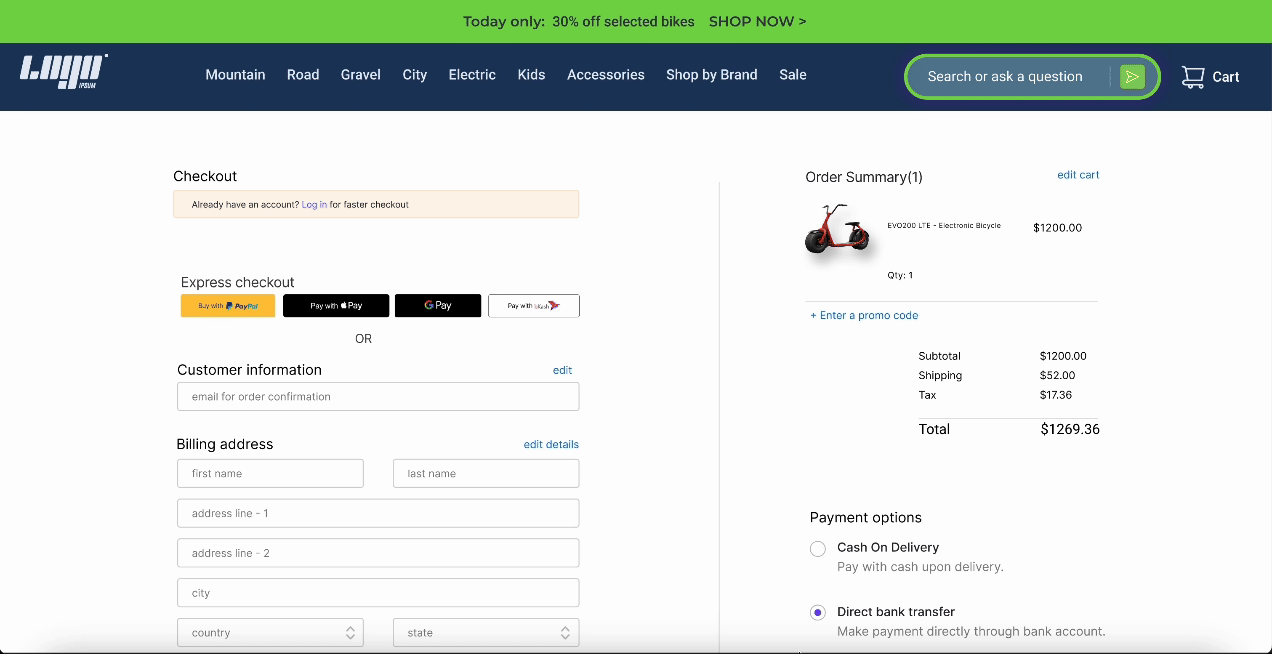
3. Guest Checkout:
I redesigned the homepage to highlight popular categories and products upfront, with prominent call-to-action buttons that guided users towards exploring specific bike types or sales promotions.
4. Enhancing Product Discovery and Cross-Selling Opportunities on Product Pages
I added sections like Related Products and Customers Who Bought This Also Liked on the individual bike product pages. These additions can help increase cross-selling opportunities and keep users engaged with similar products, which may lead to higher average order value and conversion rates.

Usability Testing (Round 1)
I conducted usability testing with 5 participants who matched the target demographic (24-38 years old, high-income earners, and avid bikers).
Key Findings from Round 1:
1. Comparison Tool
Participants appreciated the side-by-side comparison feature but found the filter options hard to locate, an issue that had been present in the original design.
2. Guest Checkout
The new guest checkout process was a significant improvement, with users praising its simplicity, but they recommended clearer calls to action (CTAs) to guide them through the process.
Design Iteration: High-Fidelity Prototyping
Based on the validated design and usabilities issues found on the first usability testing. Based on feedback from the first round of testing, I made the following refinements
1. Design System
Based on our design system and target user personas, we aimed for a unique style that stands out from typical biking websites. While many competitors focus on a sporty aesthetic with bold reds to symbolize energy and athletics, our target users are high-income earners, and our brand identity emphasizes trust and luxury. Therefore, beyond the sporty and modern design elements, our color palette and design choices also needed to convey reliability and a sense of premium quality, appealing to the high expectations of our audience.

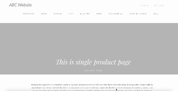
2. Comprehensive Product Details
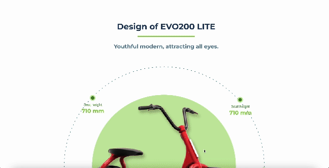
Since 70% of our target users are serious, high-income bikers who carefully research their purchases, the item page should go beyond high-level information. It must include detailed specifications, such as dimensions, weight, and technical features, organized into clear categories. Additionally, adding similar products can help guide users through product comparisons, ensuring they find the perfect fit while potentially increasing engagement and cross-sell opportunities.
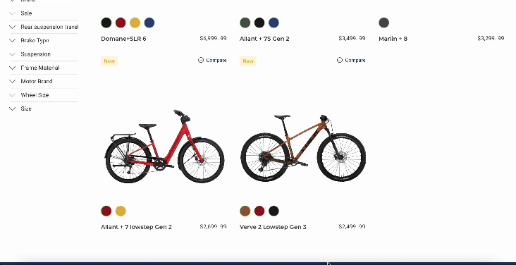
3. New Feature - Comparison Tool
I added a comparison feature that allowed users to select up to 3 bikes and view them side-by-side. This comparison tool highlighted key features such as price, weight, frame material, and gear system, making it easier for users to make an informed decision.
4. Streamlined Checkout
Simplifying the checkout process, especially for guest users, reduces cart abandonment.
Usability Testing Round 2 and Final Iteration
In the second round of testing, users appreciated the ability to compare bikes more easily. This improvement greatly boosted user confidence in choosing the right bike, leading to a reduction in the number of pages viewed without adding items to the cart.
However, a key insight emerged during testing: one user highlighted the need for a more specific search function, especially for those who are unsure which category of bike to choose. This is particularly valuable for beginner users who may not want to conduct extensive research on their own. To address this, I developed an AI-powered search feature that guides users through the selection process, helping them find the right bike without needing to know all the details upfront.


Final Outcome and Impact

Improved Product Discovery
With clearer categories and enhanced filtering, users were able to find the bikes they were looking for faster, leading to an increase in product views turning into cart adds.

Reduced Cart Abandonment
The introduction of guest checkout, as well as clearer navigation, reduced friction in the checkout process, leading to a significant decrease in cart abandonment rates.

Enhanced Decision Making
The comparison tool helped users differentiate between bikes more effectively, making them more confident in their purchases.