Nova Hu

Project
TravBook
summary
TravBook is a one-stop service APP focusing on travel sharing to help users search travel guilds and booking
Resposibilites
UX Design
UX Research
Project Overview
TravBook is a social application that allows travelers to share travel posts and online travel shopping. TravBook makes it easy for users to view travel posts while adding hotels they are interested in into their shopping carts.


Problem I try to solve

Switch between searching travel guilds and travel shopping app

Lack of social media for travelers

Review is no longer a monotonous picture and text
StoryBoard
This storyboard helps us visually predict and explore a user's experience with TravBook.

User Flow
We anticipate our users' needs and compare the current user flow and ideal user flow which helps us to understand how TravBook simplifies the user experience.
Current User Flow

Ideal User Flow
.png)
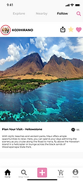
Low-fi wireframes
We created low-fi wireframes to ensure that the developers and users get a clear understanding of the functionalities and designs that the software needs to support.
I used Balsamiq to create 21 screens. There are separated into 5 sections: log in and sign up, home screens, post details, and booking.


Test With Users
Early testing helps designers better understand the acceptance level of users during initial design processes. So I planned my user testing before I start my hi-fi wireframes design.
After I finished the low-fi wireframes, I linked all pages together, and I tested my low-fi prototype with the product manager (in this course, product managers are my professor and TA). Also, I tested with 9 target users. Here's their feedback:
Product Managers
-
Manu bar should be moved from top to bottom
-
Change the logo
-
Re-design the search screen
-
Simplify login and sign-up steps
Target User
-
The booking process is cumbersome
-
Some screens look like a web page
-
Delete some unnecessary pages
-
Re-design booking screens
Hi-fi wireframes
Based on the feedback that product managers and target users provided to me, I changed my low-fi wireframes, and start to design my hi-fi wireframes.
I designed 28 screens and 4 different versions. After the 1st and 2nd versions were completed, I asked the product manager to review my design and made changes based on their feedback.
After the 3rd version was done, I did the user testing with the external users on the UserTesting website.